Thursday, April 30, 2009

Week 15


Assignment: (Publish our website)
Our assignment for this week was to put our completed website that we made in iWeb on Xythos.

Craft: (How did I do it)
After we logged onto Xythos we need to put our web content into the www folder.  We had to upload every folder in the folder that was published to the desktop.  When the upload was complete we could go visit the index page and get our own personal link. 

Composition: (Arrangement of the elements)
We had to make sure that our home page was our about me page because that is what is different in each website.  Next, we had to make sure that we had a link to this blog somewhere in our site.  Also, we had to make sure that our slideshow of the comic strip plays in fullscreen. 

Concept: (What am I trying to say)
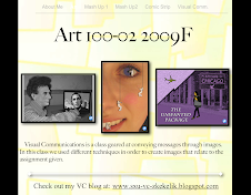
This assignment was made for us to understand how to make a website in iWeb as well as show off our art in a different media.  I decide to make my site in a manner that would show my personal style while making my art pages look classy.  
 

Friday, April 24, 2009

Week 14


(Home Page of my site)

Assignment: (Work on iWeb)
The week 14 assignment was to continue work on our iWeb sites.  

Craft: (How did I do it?)
I continued working on my site by adding some more pages.  The about ME page and HOME page where ok but I needed to make them better.  I added two pages for the two different mash ups.  I started by changing the background image of the website.  After that I decided on a new font to make the website look like my own instead of how the temple looked.

Composition: (Arrangement and order of elements)
The HOME page of my site is where a visitor will have to make their own decisions.  They can pick to go to any of my three art pieces or scroll down on the page to click on the "meet the artist" link to go to the ABOUT ME page.  I also decided to add "next and prev" buttons on the bottom of each page so there is more navigational options for the user.

Concept: (What are I trying to say?)
With this site I am trying to capture my own personal style in a way that others can check out my artwork.  In this way I am able to have a page about me where the visitor to my site can understand who I am as a person.  They also can look at all of my artwork as well as read a little about it and then scroll down to see how I made it.  This gives the visitor different ways to appreciate the site and the art.

Sunday, April 19, 2009

Week 13

  
(Photos for iWeb)

Assignment: (Start iWeb creation) 
This week we were assigned to start a iWeb website in order that we could put all of your artwork on the site.  This website will be a second way for us to display our artwork other then this blog.

Craft: (How did I do it?)
In order to create this site we first had to open iWeb and pick a theme we like.  We where taught in class a few of the basics of iWeb and thus we were on our way to making our own website.  I chose a more basic theme so that I really had control over what the site would look like.

Composition: (Arrangement of elements)
In order to complete this assignment we also had to make for folders in which we put all of the picture of our artwork.  These pictures will be used for the website and in order to make the site work correctly we needed to have some organizational tools in place.  One folder was for our Lincoln pics, one for are mash up 2 pics, one with are comic strip, and the last was a folder for pics of ourselves.
Concept: (What am I trying to say?)
By this creation of a website I am going to attempt to make each page of my website different for each piece of artwork.  by doing this each project will have its own fell and can be view in a different way then how my fellow students artworks are viewed.

Week 12

Exempt for winning Comic Strip Challenge 

Tuesday, March 31, 2009

Week 11


Assignment: (Only use two colors)
The Assignment for this week revolved around color.  In class we talked about different ways to describe color, such as: Hue, Saturation, Value, Primary, Complimentary.  We also talked about the color wheel and the difference between warm and cold colors.  So this week we had to make our whole comic only using two colors.  

Craft: (How did we do it?) 
The first step was to make the background layer a normal layer.  Then, make a new layer with a really dark color.  Next, we had to multiply the photo in order for the color to be seen in the photo.  The last step was to make a sandwich of layers, top-photo / middle-color layers / bottom-dark universal color layer.  In order to change the colors of all our pictures we first had to make layers for each color we were going to use.  Each picture had a different amount of layers because each photo had different areas to color.  Then, we could use the brush and eraser tool to color the picture.  

Composition: (Arrangement of elements)
In order to effectively accomplish this assignment, we had to use one color as the background and foreground and the other color as a marker for important content. We chose to use purple as the background and foreground color because it was dark and would make the other color pop.  The second color we chose was yellow. Yellow worked very well because it is high contrast to purple. By using these two colors effectively, we were able to make the people and important objects stand out from the rest of the photos.

Concept: (What are we trying to say?)
These photographs are meant to convey a steady progression of events leading to a humorous final scene. This final scene is meant to come as a surprise to the audience. The progression of events depict a not to out of the ordinary situation, but once the final scene is viewed, there is a sense of comedy as well as seriousness and a bit of grossness. 


Thursday, March 26, 2009

Week 10


Assignment: 
The assignment for this week was to work with are partners and improve on are comic strip story with pictures and Photoshop.

Craft:  
This assignment calls for a lot of group work and communication.  In order for the project to be completed well are group needs to stay organized and on top of the assignments.  For most of these photos we just told the picture as we wanted it to look so we would not have to photoshop it.  For the ones that we could not accomplish a single picture we had to take individual pictures and then photoshop the elements into one picture.

Composition:
In order to complete this assignment we needed to use filters on each of your photos.  The filter that we decided to use was the graphic pen filter.  We also decided that in order to make it look more like a comic strip we make the photos black and white.  In the end we would like to all color to the pictures be on on the two characters and some of the key elements.

Concept: 
This project is different then other assignments because of the partner element.  Because my partner and I can bounce ideas off of each other.  Also if we need help with problems in photoshop we can ask each other and figure them out together.  Also in our picture, I am in the pictures and James took all the pictures, so that make for a easy way for use to get the assignment done. 


Friday, March 20, 2009

Lipstick & Dynamite Film Screening

On Wednesday, March 18, there was a film screening / talk about the movie, "Lipstick & Dynamite" by Ruth Lietman.  This film is about woman's role in professional wrestling.

Craft: (How was the film made?) 
This film was made using film media with video cameras along with testimony by individuals along with footage and pictures of old wrestling events.  The film has a lot of older footage of women wrestling in the ring.  Throughout the film most all of the commentary is from old talk shows and more so of past female wrestlers.  The female wrestlers are talking about how things where in the past and stories of different events that happened throughout their career as a women professional wrestler.

Composition: (Arrangement of elements within the film)
The film starts off by a clip of a woman on a talk show where the object of the show is to guess what profession she has.  Throughout the entire film this clip is shown in different spots in small sequences so at the end of the film the panel on the show has to guess who is the wrestler.  This is what ties the film together from beginning to end.  The film starts with the early beginnings of how females got into the wrestling scene by the actual wrestlers telling stories and events of what happened back then.  In the middle of the film many wrestlers where introduced and gave backgrounds and history of their own personal roles in wrestling.  The end of the film is where there is a reunion for past wrestlers where everyone gets together to visit and talk about the good times.   

Concept: (What is the film maker, Ruth Lietman, trying to say?)
What I believe Lietman is trying to convey to the audience is how important women are in sports and more over, society.  Most of what was told by the past wrestlers was how that when the promoters really needed money they would have women's bouts.  Also that the women where what really made the whole wrestling scene spark and become what it is today.  Another issue, which I think is being brought up, is how women where treated as well as women's role in society at this particular time period.  Women where in no way thought of as being a wrestler so that all of these individuals who stepped out of the traditional role of women at the time where really pioneers to women's movements.    


Week 8

Assignment: (Comic Strip Pictures)
The week 8 assignment was to have pictures taken of places and things that would be able to be placed in each box of our comic strip in order to tell our story to the audience. 

Craft: (How did we do it?) 
The week before this assignment my partner and I had drawn out our comic strip on paper in order that we had a clear idea of what types of pictures we needed to take.  After we have established the places and situations that we needed to photograph we tried to get the pictures.    

Composition: (Arrangement of elements)
It is still necessary that we get a few more pictures in order to clearly portray our story to the audience without using words.  In these pictures we will need both of the models to be together in difference situations.   

Concept: (What are we trying to say?)
The pictures that we have taken and will take are of both the models and in the places where they need to be.  For these pictures there will not need to be any Photoshopping of the people and places.  A few other pictures that we will use will have to be where the model is Photoshopped into a photo of another place or background.

Wednesday, March 11, 2009

Week 7

Assignment: (Comic strip story)
To think of and develop a story that involves three situations 
1.) A person waiting 2.) A person traveling 3.) A package

Craft: (How did I do it?)
When we started this project, we were given the option to either work with a partner or work by ourselves.  The class voted on partners so the first step was to choose a group mate.  After we all had partners the next step was to brainstorm on a story.  For a week my partner and I bounced ideas off each other.  We came up with a story and wrote it down on paper.  During our first class back from spring break we told our stories to the rest of the class.  The next step is to create photos that can tell our story through pictures only, no text. 

Composition: (Arrangement of elements)
The story that my partner and I created was about a love affair.  The person waiting is a man in his mid 20's.  The women traveling is a business woman around the same age as the man.  The package is a box that the man is waiting to give her at a restaurant where they are to meet.  The reason that these two individuals know each other and are meeting again is because they had a one night stand about a month ago.  After the woman went home the man gave her a call and told her he had something that he had to give her. The pictures for this story are focused around the airport, a restaurant, and the man's house.  In order to convey the message, the pictures must have certain characteristics in them.  A major focus must be on the two individual's faces.  These expressions will tell a lot of information to the viewer and will help the viewer get a sense of how the story is playing out.    

Concept: (What am I trying to say?)
The concept of this story is to bring up a serious conversation but by doing it in a funny way.  The ending is funny but is a very real and serious problem that people have to deal with.  After someone reads this story through our pictures a topic will be brought up and this story acts as a icebreaker for a more serious situation.    

Tuesday, February 24, 2009

Week 6

(Click to enlarge and view details)

Assignment: (First draft of mash up #2)
The main objective for week six was to create a image, with the help of the pictures that we have taken and Photoshop, to convey a message to our audience. 

Craft: (How did I do it?)
I started with all the photos I taken during week five.  I looked at all of them and picked out certain ones that I liked and would fit well in the composition of my image.  The background of my piece was a large photo of a face.  Before I chose the specific picture I opened Photoshop and made a new blank document.  I chose a 11X17 page with 300 resolution.  Then I imported the background picture and sized it accordingly.  Next, I started to cut out the images I wanted to put in my picture.  I mostly used the magic wand tool to select the little worker people. I also used the mask to make sure I selected everything I wanted.  I did the same thing for all four mini people.  Then I imported all of them onto the background and resized them.  After I placed them were I wanted them to be I added shadows on all of them to make it look more realistic.  Then I started working on the highlights of the face by making each aspect a new layer.  This gave me the ability to move the layer around on the background image as well as not make permanent marks on the background layer.  These are most of the techniques I used to complete my first draft. 

Composition: (Arrangement of elements)
The main element of the image, at first, is the large right side of a face.  As you look closer you are able to see little mini beauty workers fixing certain areas of this persons face.  There is one changing the eye color, one covering up a pimple, one applying blush, and one whiting the persons teeth.  All of the little workers are in different parts of the face so that they all can be easily seen and what they are doing can be easily understood.  I chose 11X17 paper size so that these workers could be seen in detail and would not be overlooked.

Concept: (What am I trying to say?)
This images entitled, "Beauty of the Future," was created as a response to all of the new and sometimes controversial ideas of beauty enhancement.  With all of the new technology and scientific discoveries how far will people go to change themselves?  Will at one point individuals put super small organisms on there face to look make them look good?  How far is too far?  These are the issues and thoughts are what I want this very image to raise. 

Wednesday, February 18, 2009

Week 5


Assignment: (Take 25 pictures / Think of idea)
The assignment for this week was to think of an idea that we felt passionate about. Then we will be able to create a mash up in Photoshop that would visually say the message to the viewer. In order to start this assignment I needed to have an idea as well as take 25 pictures to get started.

Craft: (How did I do it?)
The first step in this process was to think up an idea that I had feelings about and something I could make a cool picture out of. The idea that struck me as interesting and controversial at the same time was one of beauty. I was on cnn.com and clicked on a story about new cream that makes a woman's eye lashes grow really long, this got me thinking. Nowadays, it seems everyone is getting some kind of unnatural physical enhancement. This led me to the topic of my project "artificial beauty of the future." So after I had thought of my idea I tried to think of a way to convey a story in the form of a photo. I decided to find some props around my house and made a bit of a "pink" screen instead of a green screen. I asked my girlfriend to be my model and started to take pictures. I took some close up pictures of her face as well as a lot of different posses she made with all the props acting as the little beauty physicians. Above are some of the pictures that I will probably use for my mash up.

Composition: (Arrangement of the elements)
In order to achieve my message I need to arrange the photo in a way that makes the ideas simple and easy to understand. I have decided to make the background of the photo one side of a natural human face. Then, on this face will be "futuristic beauty physicians" working. These beauty physicians are little clones of the individual that is being "beautified". These clones are miniature and will be all over the face accomplishing different task, i.e. applying makeup, whitening teeth, enhancing eye color, etc. The important part of my picture is making sure that the beauty physicians are able to be seen and it can be easily understood what they are doing.

Concept: (What am I trying to say?)
One sentence of what I am trying to say would be, "If science continues to test new boundaries and the want for artificial physical enhancement grows, then what unethical extremes are humans capable of reaching to accomplish these goals."
As I started to think about all these new scientific technologies used to improve ones physical appearance, I also thought about how science is testing new ethical questions these days - such as cloning. I reflected on these two situations and thought; what if in the future these two things meet up and become one? What if in future artificial beauty improvement techniques involved individual personalized people which did all the work for each client and what if these workers where actually little clones of the person who wanted these beauty improvements. This is my idea and what I will try to convey it to my audience.

Monday, February 16, 2009

200 Lincoln's


On Friday 13th, myself and my fellow classmate James went to the Chicago Art Department to check out the 200 Lincoln's exhibit.  The main reason that I wanted to go was because my art work along with my other classmates work would be apart of this show.  We have been working on Abe Lincoln mash up photos for a few weeks in class and now our finish pieces where going to be on display in the gallery.  We arrived at the gallery early and was able to get a close up look at all the art.  There was a ton of cool art, I really liked that the exhibit was open to all media types.  This allowed for every piece to have different style and always kept my eye looking forward to the next piece.  This was a really cool experience, making my own art and then being able to see my finish piece in an actually art gallery.   

Wednesday, February 11, 2009

Week 4


Assignment:
(Improve our Lincoln mash ups)
The assignment for week 4 was to think about the comments and ideas we heard from others during the critique on Wednesday.  Then try and improve our photo in some of those ways.  We need to produce a final rough draft. Also we needed to format our image so that it would fit well on the 11 x 17 paper since that is the size are finished photograph will be printed on.

Craft: (How did I do it?)
During our first critique I received some good comments which helped my while I worked during this week.  The main issue I wanted to improve was the neck area around Lincoln's collar.  In order to accomplish this I copied and pasted a portion of the shirt collar from another picture onto the Lincoln photo.  By doing this I was able to put the portion of the imported collar on top of Lincoln's neck so that it looked clean and neat.  Also I lighten up the image of Obama on the laptop screen so it would pop a bit more.  Finally, I changed my image size in Photoshop under "image" - "image size"  I made sure the; Resample Image, Constrain Proportions and Scale Style boxes where checked and that the Resolution was 300.  Then I changed the Document Size to as close as I could to 11 x 17. 

Composition: (Arrangement of the elements)
The two elements of Lincoln and the laptop where in a pretty good order, so I did not have to work too much on making adjustments.  Lincoln is in the foreground and is the bigger of the two images which makes him the first thing your eye catches.  The laptop with President Obama's images on it is in the background.  Also, because I lightened up the image on the laptop your eye will travel straight from Lincoln's head towards the image of Obama, which is the order I wanted the the two men to be seen in, Lincoln first then Obama.

Concept: (What am I trying to say?)
My message is still the same as it was before.  Lincoln, setting in front of a laptop during the current area, is looking at the current President, Obama.  These are two men that have totally changed America's thoughts and ideas.  Also, this picture symbolizes how Lincoln, if he was alive today, would (I personal opinion) be very interested and inspired by Obama and what it means to have elected a African American President.  In the same way Obama has been very interested and inspired by Lincoln throughout his way to the presidency.  I have named the Photograph - Impossible possible. 

Tuesday, February 3, 2009

Week 3


Assignment: (Combine two pictures together)
The project for week 3 was to mash up an old photo of Lincoln which we have found on the internet with a new photo I personally taken of the current era.

Craft: (How did I do it?)
In order to start this project I needed to find or take a picture that I wanted to put Abe into.  I looked at all the photos that I already have taken throughout the years and I did not find any that I liked.  So I decided to take a picture for a specific reason, to convey the message I wanted within the mash up.  I took a picture of my dad by the computer in order to accomplish the new picture aspect.  Then I started looking through my contact sheet of the Lincoln photos.  I found a few pictures where Lincoln's head was looking in the directing I wanted.  Then I opened both the new and old pictures in Photoshop.  I selected Lincoln's head with the magic wand tool and then copied and pasted it into a blank Photoshop document.  From there I zoomed in and took my time to erase everything around Lincoln's head.  Then I copied and pasted Lincoln's head into the photo of my dad.  I then had to resize Lincoln's head in order to get the proper look of realism.  Finally, I lowered the saturation of both pictures down to zero in order to achieve a black and white photo.

Composition: (Arrangement and order of the elements) 
In my photograph I wanted two main elements to be seen, 1) Abe Lincoln in front of the computer. 2) A computer with some image of Barack Obama on it.  The picture that I took of my dad had a lot of empty space around the edges.  So I cropped the pictures so that the image was full of the two subjects I had in the photo.  I also wanted to make Lincoln the main focus of the picture because of the assignment so that is why he is larger and his face is the first thing your eye is drawn to.

Concept: (What am I trying to say?)
My main message in this photograph is two individuals that have ratified a nation at two very different time periods.  This picture is meant of signify change, pass and present.  Lincoln is now sitting in my current era, looking at how change has come to America in 2009.  One aspect which I really like about the picture is the direction of both Abe and Obama's face.  It looks like both men are starring off toward the right hand direction.  This photo signifies that both men have changed America in some way, now they are thinking - looking into the future, to see who or what will be the next big change in America.

Tuesday, January 27, 2009

Week 2

Assignment: (25 old / 25 new)
The assignment for week 2 was to find 25 pictures from the Lincoln era (1809-1865).   Some of these pictures need to be of Lincoln himself while others could be pictures of other things which I personal found interesting.  All 25 of these photos needed to be found on the internet. The second part of this assignment was to get 25 pictures from the current era.  Of these 25 photos 15 need to be taken sometime during the previous week while the remaining 10 could be from before then.  All of these pictures had to be taken by myself.

Craft: (How did I do it?)
The way that I choose the Lincoln era (old) pictures was by searching the internet.  I found most of the photos while looking on Google.  Another place I found a lot of good lincoln era pictures was, www.civil-war.net/cw_images/index.htm.  When I would find a picture that I liked I would click on it in order to enlarge it to its maximum size.  Then I could see if the photo was good quality / high resolution.  For the second part (new) I tried to take 15 pictures of thing that might either relate to the contend of the old pictures or just things I though looked cool.  I also took 10 pictures from my iPhoto library on my personal computer.  I picked photos that I thought would relate to the old lincoln era pictures I already selected.  I saved all of these photos on my flash drive in two different folders - old / new.

Composition: (Why did I choose these pictures as my best)
I picked these two pictures as my best ones because of two different reasons.  1). The Lincoln era pictures is of Abe Lincoln (center) and two of his secretaries, John Hay and John Nicolay. This picture was taken by Alexander Gardner in 1863.  I like it because I think it is a nice composition of the three men.  This picture says to me that Lincoln is the center of focus and he has supporters around him.  I also like how Lincoln and the man standing behind him are not looking at the camera.  This was obviously a decision they both made because cameras couldn't take pictures as quick as we can now, so they didn't just look away at the wrong split second.  2). The new era picture I picked was taken by myself while hiking in Yellowstone.  I like it the best because I think it is a awesome view of a steaming stream running through the woodland.   
    
    
Concept: (Which two pictures might I mix together) 
I choose these two pictures as best to mash together because they are both an example of war equipment yet they are from to totally different time periods. 1.) The Lincoln era picture is of George A. Custer and General Alfred Pleasonton in 1863.  They are both mounted on horse back and facing each other.  I picked this photo because it was the most unique one I found in the Lincoln era group.  2.) The picture I choose from the current era was of a army tank.  I took this picture last weekend in Crown Point, IN.  It is part of a Vietnam memorial.    
    

Monday, January 12, 2009

Week 1


Assignment: Blog set up

Craft: Found picture of myself and saved it to my desktop.  Went to blogger.com and logged into my gmail account.  Then I made the blog title "VC2 Zach Kekelik"  and the blog address "sxu-vc-zkekelik"  Then I started working on this Week 1 blog.

Composition: The reason why I picked this photo is because its my favorite picture of me and my girlfriend and it was taken when we were at a Chicago Fire soccer game.   I picked this templet because I liked the style of this one and then I changed the text and colors.

Concept: I am so good because I can fold a dollar bill in to a jumping frog.

Photo: (above)