Thursday, April 30, 2009

Week 15


Assignment: (Publish our website)
Our assignment for this week was to put our completed website that we made in iWeb on Xythos.

Craft: (How did I do it)
After we logged onto Xythos we need to put our web content into the www folder.  We had to upload every folder in the folder that was published to the desktop.  When the upload was complete we could go visit the index page and get our own personal link. 

Composition: (Arrangement of the elements)
We had to make sure that our home page was our about me page because that is what is different in each website.  Next, we had to make sure that we had a link to this blog somewhere in our site.  Also, we had to make sure that our slideshow of the comic strip plays in fullscreen. 

Concept: (What am I trying to say)
This assignment was made for us to understand how to make a website in iWeb as well as show off our art in a different media.  I decide to make my site in a manner that would show my personal style while making my art pages look classy.  
 

Friday, April 24, 2009

Week 14


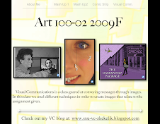
(Home Page of my site)

Assignment: (Work on iWeb)
The week 14 assignment was to continue work on our iWeb sites.  

Craft: (How did I do it?)
I continued working on my site by adding some more pages.  The about ME page and HOME page where ok but I needed to make them better.  I added two pages for the two different mash ups.  I started by changing the background image of the website.  After that I decided on a new font to make the website look like my own instead of how the temple looked.

Composition: (Arrangement and order of elements)
The HOME page of my site is where a visitor will have to make their own decisions.  They can pick to go to any of my three art pieces or scroll down on the page to click on the "meet the artist" link to go to the ABOUT ME page.  I also decided to add "next and prev" buttons on the bottom of each page so there is more navigational options for the user.

Concept: (What are I trying to say?)
With this site I am trying to capture my own personal style in a way that others can check out my artwork.  In this way I am able to have a page about me where the visitor to my site can understand who I am as a person.  They also can look at all of my artwork as well as read a little about it and then scroll down to see how I made it.  This gives the visitor different ways to appreciate the site and the art.

Sunday, April 19, 2009

Week 13

  
(Photos for iWeb)

Assignment: (Start iWeb creation) 
This week we were assigned to start a iWeb website in order that we could put all of your artwork on the site.  This website will be a second way for us to display our artwork other then this blog.

Craft: (How did I do it?)
In order to create this site we first had to open iWeb and pick a theme we like.  We where taught in class a few of the basics of iWeb and thus we were on our way to making our own website.  I chose a more basic theme so that I really had control over what the site would look like.

Composition: (Arrangement of elements)
In order to complete this assignment we also had to make for folders in which we put all of the picture of our artwork.  These pictures will be used for the website and in order to make the site work correctly we needed to have some organizational tools in place.  One folder was for our Lincoln pics, one for are mash up 2 pics, one with are comic strip, and the last was a folder for pics of ourselves.
Concept: (What am I trying to say?)
By this creation of a website I am going to attempt to make each page of my website different for each piece of artwork.  by doing this each project will have its own fell and can be view in a different way then how my fellow students artworks are viewed.

Week 12

Exempt for winning Comic Strip Challenge 

Tuesday, March 31, 2009

Week 11


Assignment: (Only use two colors)
The Assignment for this week revolved around color.  In class we talked about different ways to describe color, such as: Hue, Saturation, Value, Primary, Complimentary.  We also talked about the color wheel and the difference between warm and cold colors.  So this week we had to make our whole comic only using two colors.  

Craft: (How did we do it?) 
The first step was to make the background layer a normal layer.  Then, make a new layer with a really dark color.  Next, we had to multiply the photo in order for the color to be seen in the photo.  The last step was to make a sandwich of layers, top-photo / middle-color layers / bottom-dark universal color layer.  In order to change the colors of all our pictures we first had to make layers for each color we were going to use.  Each picture had a different amount of layers because each photo had different areas to color.  Then, we could use the brush and eraser tool to color the picture.  

Composition: (Arrangement of elements)
In order to effectively accomplish this assignment, we had to use one color as the background and foreground and the other color as a marker for important content. We chose to use purple as the background and foreground color because it was dark and would make the other color pop.  The second color we chose was yellow. Yellow worked very well because it is high contrast to purple. By using these two colors effectively, we were able to make the people and important objects stand out from the rest of the photos.

Concept: (What are we trying to say?)
These photographs are meant to convey a steady progression of events leading to a humorous final scene. This final scene is meant to come as a surprise to the audience. The progression of events depict a not to out of the ordinary situation, but once the final scene is viewed, there is a sense of comedy as well as seriousness and a bit of grossness. 


Thursday, March 26, 2009

Week 10


Assignment: 
The assignment for this week was to work with are partners and improve on are comic strip story with pictures and Photoshop.

Craft:  
This assignment calls for a lot of group work and communication.  In order for the project to be completed well are group needs to stay organized and on top of the assignments.  For most of these photos we just told the picture as we wanted it to look so we would not have to photoshop it.  For the ones that we could not accomplish a single picture we had to take individual pictures and then photoshop the elements into one picture.

Composition:
In order to complete this assignment we needed to use filters on each of your photos.  The filter that we decided to use was the graphic pen filter.  We also decided that in order to make it look more like a comic strip we make the photos black and white.  In the end we would like to all color to the pictures be on on the two characters and some of the key elements.

Concept: 
This project is different then other assignments because of the partner element.  Because my partner and I can bounce ideas off of each other.  Also if we need help with problems in photoshop we can ask each other and figure them out together.  Also in our picture, I am in the pictures and James took all the pictures, so that make for a easy way for use to get the assignment done. 


Friday, March 20, 2009

Lipstick & Dynamite Film Screening

On Wednesday, March 18, there was a film screening / talk about the movie, "Lipstick & Dynamite" by Ruth Lietman.  This film is about woman's role in professional wrestling.

Craft: (How was the film made?) 
This film was made using film media with video cameras along with testimony by individuals along with footage and pictures of old wrestling events.  The film has a lot of older footage of women wrestling in the ring.  Throughout the film most all of the commentary is from old talk shows and more so of past female wrestlers.  The female wrestlers are talking about how things where in the past and stories of different events that happened throughout their career as a women professional wrestler.

Composition: (Arrangement of elements within the film)
The film starts off by a clip of a woman on a talk show where the object of the show is to guess what profession she has.  Throughout the entire film this clip is shown in different spots in small sequences so at the end of the film the panel on the show has to guess who is the wrestler.  This is what ties the film together from beginning to end.  The film starts with the early beginnings of how females got into the wrestling scene by the actual wrestlers telling stories and events of what happened back then.  In the middle of the film many wrestlers where introduced and gave backgrounds and history of their own personal roles in wrestling.  The end of the film is where there is a reunion for past wrestlers where everyone gets together to visit and talk about the good times.   

Concept: (What is the film maker, Ruth Lietman, trying to say?)
What I believe Lietman is trying to convey to the audience is how important women are in sports and more over, society.  Most of what was told by the past wrestlers was how that when the promoters really needed money they would have women's bouts.  Also that the women where what really made the whole wrestling scene spark and become what it is today.  Another issue, which I think is being brought up, is how women where treated as well as women's role in society at this particular time period.  Women where in no way thought of as being a wrestler so that all of these individuals who stepped out of the traditional role of women at the time where really pioneers to women's movements.